This post series is about the design and development process of a product that will solve a problem. Through this journey, I will share the decisions I took and those that I ignored or postponed for later.
In doing this post series I hope to help you learn about the digital product design and development process and, with your feedback and questions, learn about my process as well. The world needs more people that understand how to build digital products.
The product
One thing I want to do better in the future is to keep track of ideas, insights, achievements. To capture these ideas I need to reflect and somewhere to store them. I wish I had a camera for my ideas and, like with photos, look back at them over the years, share them with friends and family and rediscover situations and lessons in my life that I might have not thought about in a long time.
The inspiration for this product came from “memento mori”, remember that you [have to] die.
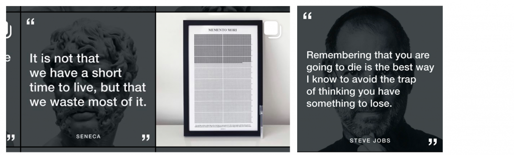
The @stoicreflections instagram advertises a “life calendar”, a grid of boxes you tick off to remind you how time is passing by and how much time you still have. Steve Jobs also said the that thought of death was a great motivator and helpful to identify the important.
The vision
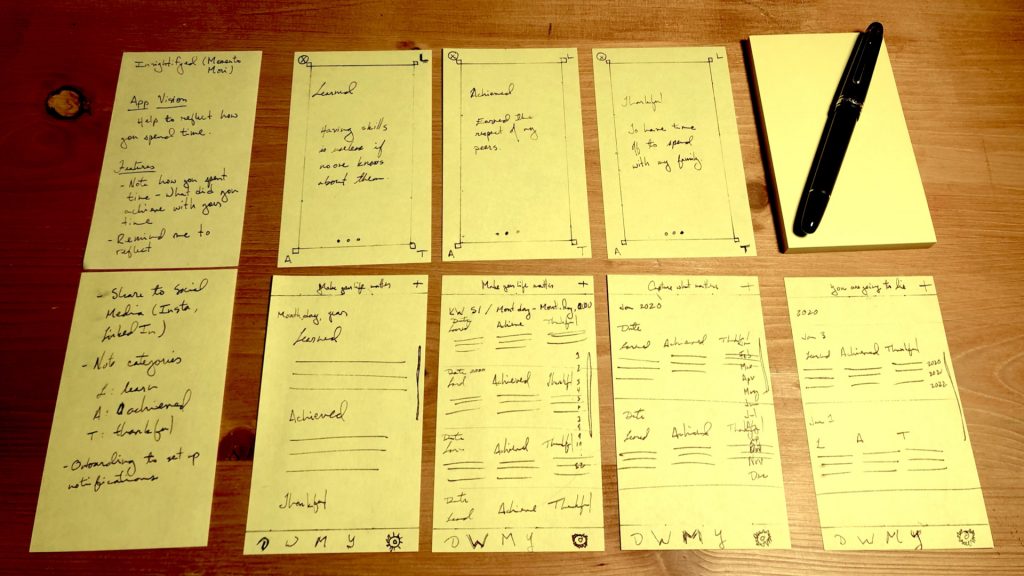
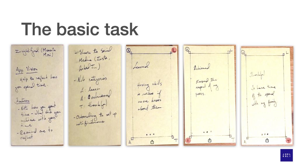
The first hour of work on this product was spent sketching how this product, which doesn’t have a name yet, will solve my problem: remind me to reflect and let me store the product of those reflections. This wasn’t the first version of the “app vision” though, it was “help to reflect how you spend time”. Although it did not feel perfect at the time, I just kept going.
My tool of choice at this phase, when starting out, are post-its. They let me move fast. When I make a mistake the amount of paper to be thrown away is small. In other words, they reduce the costs and fear of a mistake. They conveniently stick to surfaces and allow my to use my desk as a canvas.
As I started to list the features this product would have, the first one I listed was “Note how you spent time, what did you achieve with your time?”. It is very basic, but I immediately realized that I have many products to take notes. The problem is building the habit of reflecting. If I hep myself to build this habit, it will be easier to write notes. That led to the second feature – remind me to reflect or reminders.
Assuming the product helps its users build a habit of reflecting and saving those thoughts, those notes will have value and might be valuable to others. Sharing became the third feature. Right now I feel personal reflections would work well as content for Instagram, LinkedIn and Twitter.
The task of reflecting seemed a bit daunting. I felt that, if I didn’t give myself some guidance about specific topics I wanted to reflect on, I might not reflect and might not take notes. So the fourth feature became categories. This could be customizable, for now I decided to have three categories: Learned, Achieved, and Thankful.
Lastly, to make sure that users will setup their reminders for reflection time and set or select the categories that they want to reflect about, they will need to be guided through this process. The final feature on my list is onboarding.
With this set of features I believe my product has a chance of reminding me and other users to reflect, to build the habit of reflecting about specific topics important to each of us, to take a snapshot of those reflections for ourselves and maybe to share.
The basic task: writing a note
To store the insights from reflection time, you will write a note. This is the basic task you will perform in this product and it should, therefore, be accessible and enjoyable. What does that look like? What will it feel like? This is the first graphic design task of the journey.
Good design is as little design as possible. It’s just a note, so that should take as much of the screen as possible. I decided to get rid of navigation bars and placed an ‘x’ as the means to get out of this area of the app. To make the view feel somewhat different from the rest of the app, I added a line frame. I don’t know if I am keeping it yet, this is just a first draft.
Realizing that I have three different note categories and three corners available, I placed a monogram in the remaining corners. The app will allow the user to tap on a corner to go to that note category. But tapping is a lot of effort, especially when each button is at a different corner of the screen, and might disrupt the users flow. Being able to swipe between pages is much easier, so I added the page controller at the bottom that lets you swipe your way between note categories.
It is likely that users will see the page controller first and swipe between the note categories. How can I draw their attention to the letters in the corners? That’s where the red dot comes in, a small tribute to Ray Dalio’s “Principles” drawings. The dot will move from letter to letter as the users swipes through the note categories. Again, it’s just an idea to solve a user interface problem: teach the user the options the interface offers (without building a tutorial).
Lastly, this will not only be the view to create content but also to consume past content and share it. I added the share button at the bottom center of the screen. Sharing is now easily accessible.
Navigating your content
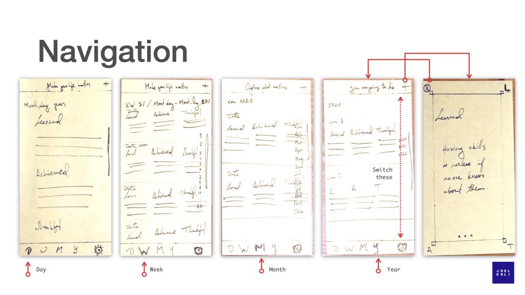
If I had to pitch this app in one sentence I would say “It is a camera for your ideas”. The camera captures content, but it is the photo app that lets you navigate content. No need to reinvent the wheel, designers have spent countless hours deciding how navigation should work in photo apps. I will take advantage of this work and of the learning millions of users have already done while using photo apps – if I use an established paradigm the app will feel familiar and users will understand how to use it from the get-go. My only job is to make the necessary adaptations so that it fits this use case.
That’s easier said than done. While navigating through days, weeks, months and years is a nice parallel to the way the iOS Photos app works today, displaying these notes presents a new graphic design challenge. You can see how in every sketch I experimented a bit. As I write this post, I am still not sure of what the final outcome should be.
On the day view, I tried creating an alternate version of the note taking view. It’s an alternative. Don’t think I’ll go there though, the note creation view is probably good enough for this purpose. With the week, month and year views, in that order, I tried to refine a view that shows all three note categories in a row. Even now, I am not thrilled with the aesthetics and I am thinking about what it will look like when every note category (learned, achieved, thankful) is not filled out every day. Will it have holes, will I create rows with only two or one note category?
As these new scenarios reveal themselves, I don’t freeze. I don’t let them overwhelm me. I’ll figure them out, later. For now I have a way to navigate content and a rough idea of how to show this content to the user. To refine this design further I need real content, I need to see this design brought to life.
Finally, I put the “create note” button at the top right corner and a settings button at the bottom right corner. I did this out of inertia and now think these buttons should be inverted. Creating a new note is something you should do every day or often. It should be available. The bottom right corner is more available than the top right corner. Conversely, adjusting settings, for example setting when you want to be reminded to reflect and write your notes, is something you will do once or a few times per year.
Notice how the way you hold a smartphone is dictating where I choose to place the buttons in the user interface. It is not a creative decision, it is a usability decision. If you take a look at the iOS Mail app you will see the “new message” button on the bottom right. The Gmail app made a similar choice. I just checked both apps to double check that I am on the right track.
Choosing what to ignore (for now)
The first draft of this app left out how onboarding will work and how the settings view will work. I am putting these off on purpose because I want to have a better understanding of the core use case and solve the design issues in navigating though the content before I take on those challenges.
Onboarding and a settings page play supporting roles to the main act: taking notes. But since my main act is still under development, it doesn’t feel like investing time on these two topics will be productive just yet. It’s like choosing the wine before you know what the main course will be.
Next steps
There are a few things I could do next: create sample content, create high fidelity designs or build a prototype. Fighting my bias to start coding, I will create high fidelity designs first with real sample content.
There is too much room for improvement to jump into prototype mode. Working on high-fi designs will allow me to work on color and typography. Some of the design problems that can be iterated more quickly by doing high fidelity designs are the display of the note categories as a list, or maybe a grid, and the single note view. High fidelity design will allow me to experiment, to see and try more options than I would with code.