

This is the second post in a series. If you missed the start you can read it here.
This post series is about the design and development process of a product that will solve a problem. Through this journey, I will share the decisions I took and those that I ignored or postponed for later.
In doing this post series I hope to help you learn about the digital product design and development process and, with your feedback and questions, learn about my process as well. The world needs more people that understand how to build digital products.
The Product
One thing I want to do better in the future is to keep track of ideas, insights, achievements. To capture these ideas I need to reflect and a place to store them. I wish I had a camera for my ideas and, like with photos, look back at them over the years, share them with friends and family and rediscover situations and lessons in my life that I might have not thought about in a long time.
The inspiration for this product came from “memento mori”, remember that you [have to] die.
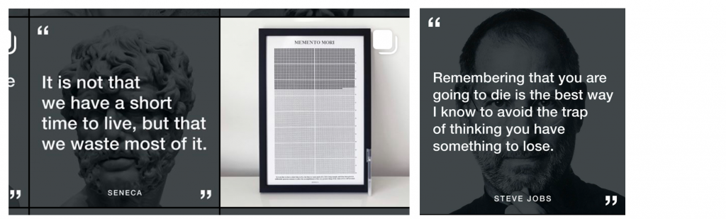
The @stoicreflections instagram advertises a “life calendar”, a grid of boxes you tick off to remind you how time is passing by and how much time you still have. Steve Jobs also said the that thought of death was a great motivator and helpful to identify the important.
Recap
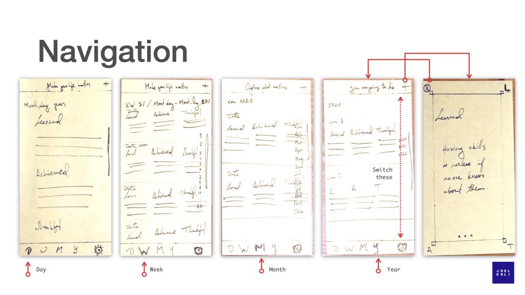
This product is a camera for your reflections. The paper prototype of the app focused on the two things a user will do the most: take notes after reflecting and browse previous notes. While in paper prototype mode I kept iterating the navigation and in the end was not happy with the browsing experience, so I decided to do high fidelity designs.
Tools
I am a fan of Keynote, Apple’s version of PowerPoint, though comparing keynote to PPT does not do it justice. I use it for presentations but also for designing Apps. Apple offers free designer resources and some of these resources are for Keynote. Apple itself uses keynote for prototyping. Checkout the “60 Second Prototyping” and “Iterative UI Design” videos to learn more and be inspired by how Keynote (or PowerPoint) can be used as a prototyping tool.
The content screen
When the user opens this app, what is the first thing they will see? Their content. If they open the app to get inspired by what they wrote a few days or weeks ago or to share an old thought with a friend or in a social network, the app opens their personal thread.
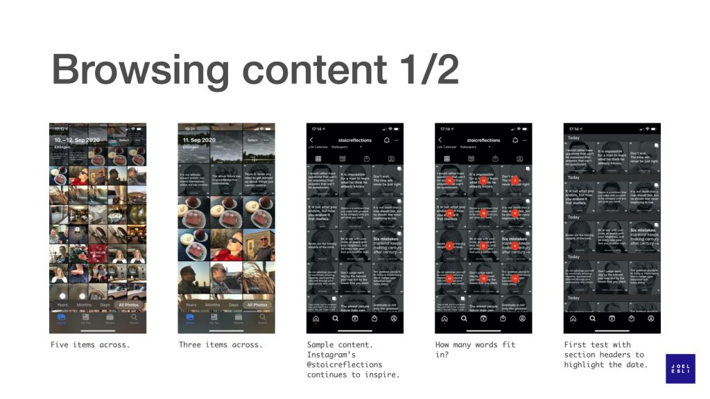
Photo apps are a source of inspiration for my app. So I turn to them to see how they solved browsing. The iPhone Photos app shows content in 5 or 3 photos per row. After comparing these two, it is obvious that five items per row would result in text that is too small to read.
Three photos per row is also what Instagram uses and checking the @stoicreflections page lets us quickly validate several things. First, you can see that text is readable. Second, you get a feel for how the page looks if the font size changes depending on the amount of text it has (sample content that I did not need to create). Third, you get to experience how the page looks when each post has different number of words and how many words are visible in each post. I could have created my own content, but time is precious. If someone has already 99% of what I need, why not learn there. Learning quickly using what already exists saves time.
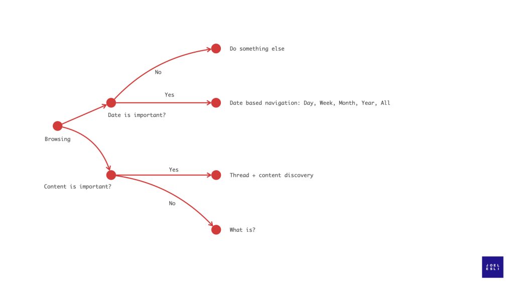
Now that I have a good example for content, I started to iterate ideas. The starting point is the original idea of organizing content by date. Do not love it. The section headers seem to break the flow of the content. I think the date can go in the post.
For quickly browsing content by date, I thought of using the same interaction design of the iOS Photos app of Days, Weeks, Months, Years. I added these features to the bottom tab bar. Then I added the navigation bar at the top with the settings button and a header section that can be used to feature your own content. Content that you might have not seen in a while.
After taking a step back, the date based navigation makes the tab bar (bottom bar) busy and it’s not clear what it will do. So I take most of the tabs away and try a version with just the plus sign to create content and the magnifying glass for a search. It feels better. If I want to find something, the search can offer a date option and it can also do a plain text search. I believe it can be more effective and clear than the day, week, month, year pattern for browsing text.
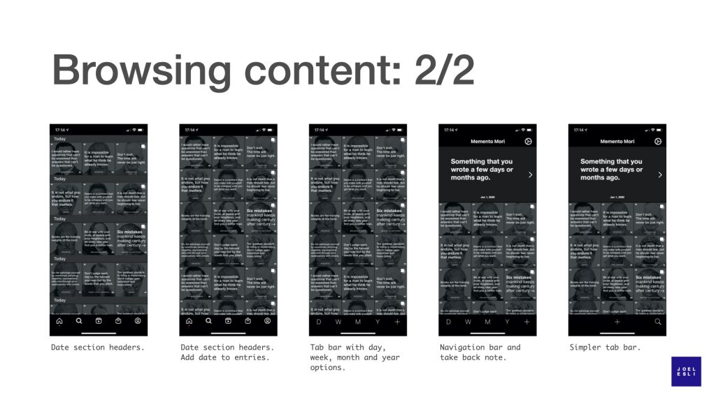
This design has taken a twist and ended somewhere different from what was originally planned. Initially, I though date was important and that is why it seemed the day, week, month, year browsing patter was the right one. But date took space away from the content. That bothered me and made me realize the content is more important than the date. The realization that content alone was enough for future browsing led to design changes that emphasized content at the expense of dates.
Reflecting and taking notes
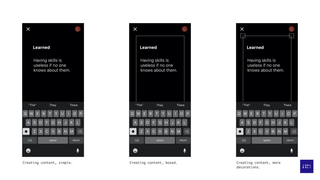
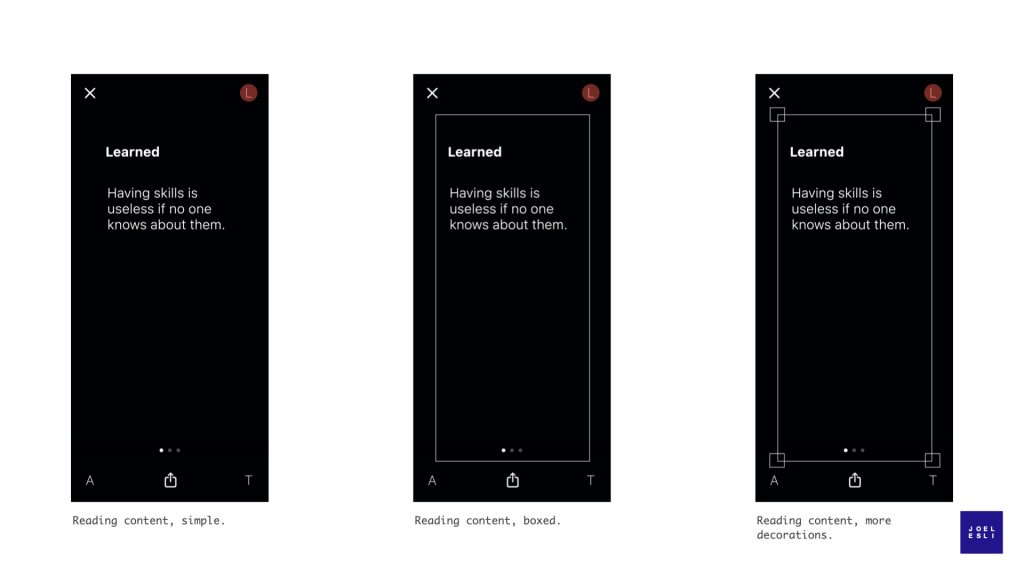
The other place where users will spend a lot of time is writing new notes and reading old ones. Creating new notes will require a keyboard, reading will not. The mockups below are simple. I played with the idea of a frame (an element I used in the paper mockups) and the complexity of the frame. The frame does not add much in terms of functionality and visually seemed frivolous. Let’s drop it.
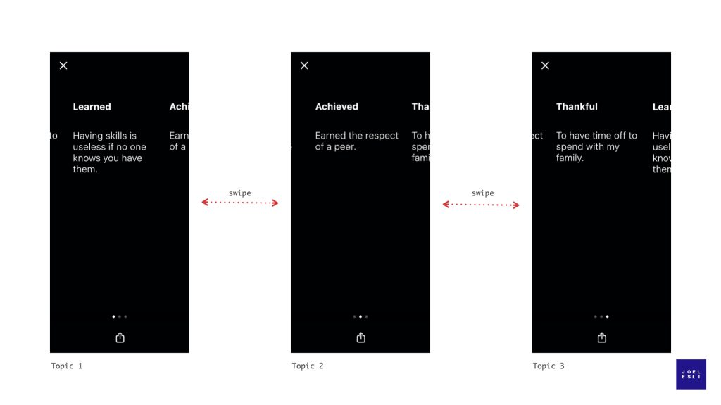
The idea is that users will reflect on up to three areas. I will offer some default options, but it seems more interesting if the user can decide on what these three topics should be. They will be your reflections, you should decide what is important to you. And you should not be forced to reflect on three things. Is there a reason for why it must be three? This brings the option of having perhaps one, two or three areas to reflect on. I do have a reason to not “allow” more than three: keeping the use case of reflecting and taking notes simple. Up to three topics feels simple, after that it stops feeling simple.
It can be changed if users ask for it. Moving on…
Assuming the user choses three topics to reflect on, swiping left and right will allow the user to switch between categories. Monograms on the corners communicate, perhaps remind the user, what the other categories are. A red dot moves from monogram to monogram.
I’ll be honest. I liked this idea. But when I sketched out how navigation would work I did not like it. The user swipes horizontally, but the monogram animation does not. It’s unnecessarily complicated. It is not coherent. Let’s throw out the monogram animation.
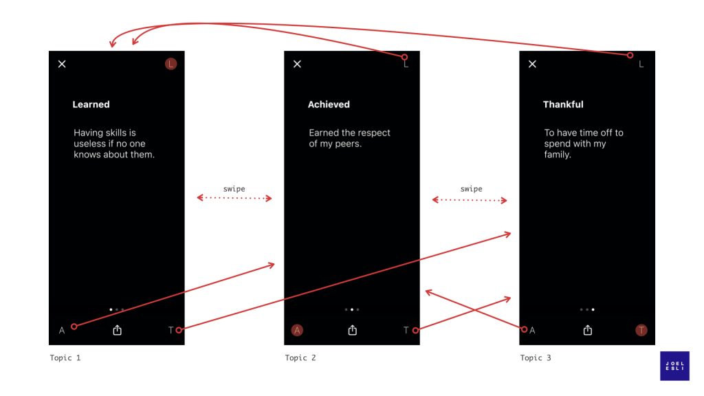
By removing the monograms, navigation becomes unidimensional – swipe left and right. Because there is a maximum of three topics, the topic you want to see is just one left or right swipe away. This approach leverages the standard features of the software development kit (iOS), it has less parts which means less code which means less bugs and lower maintenance costs down the road. I am still in love with the monogram idea, but I don’t have a good case for it. It too must go.
Putting it all together
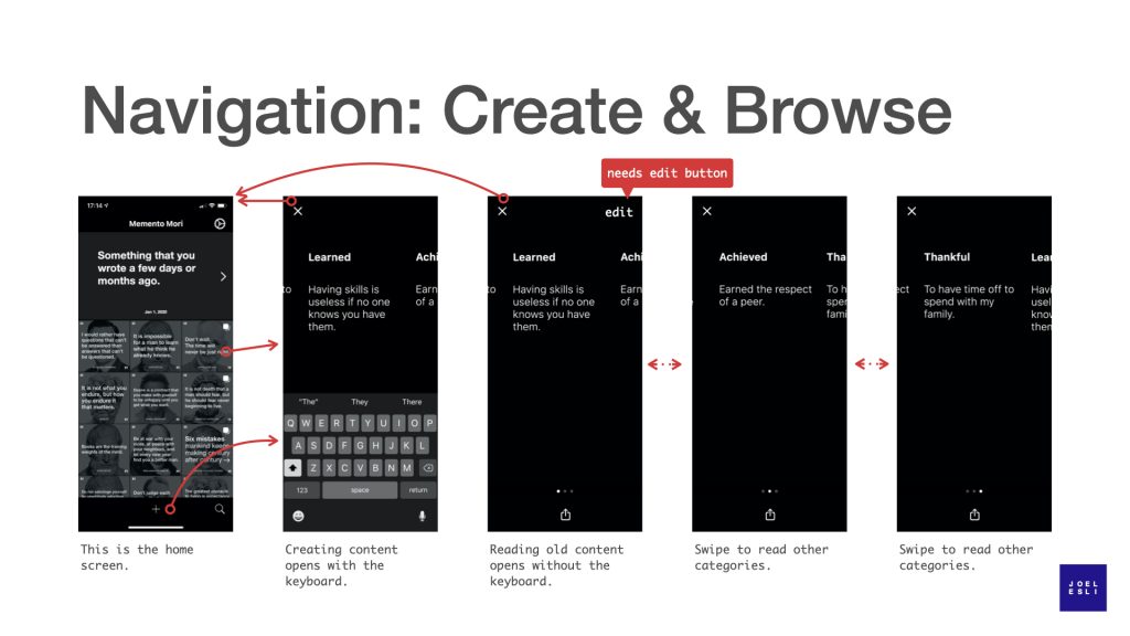
Now that the views for the two main use cases are defined, it is time to see how they would work together. The home screen is the first screen the user sees after opening the app. From there new content can be created or old content can be read and re-discovered. Previously created content can be read from the home screen or can be opened in a detail view and read with bigger font.
The design is not identical to how it will be in the real app. First, the sample content from the @stoicreflections instagram thread has background images that this app probably won’t have. Second, I did not add an edit button to the detail view. Just imagine you are about to share one of your old notes on twitter and you realize there is a typo. There has to be an edit button. Done is better than perfect. Instead of fixing all my designs for the sake of perfection, I make myself a note so that I do not forget.
Summary
High fidelity designs helped reduce uncertainty and remove a few frivolous ideas. It took a few hours to figure this out in the design phase. Iterating the design after the app was built would have taken much more time. This was time well spent. Had these frivolous features been implemented, think of the time spent in implementing, then throwing code away, refactoring the app to a new design, realizing it was not there yet, repeat.
Investments in user experience, design and usability at the beginning of a project, unfortunately, are often skipped by implementation teams. This can lead to a low quality product or expensive fixing later on in the development process. At the same time, not all design is good. Designers are creative people and following the patterns created by others, like I have done in this example, might not be top on their list. Watch out for frivolous and “new” ideas. Picasso said it well – “Good artists copy. Great artists steal.”
With the core of the application defined, it is time to start coding.